ShopDreamUp AI ArtDreamUp
Deviation Actions


Description
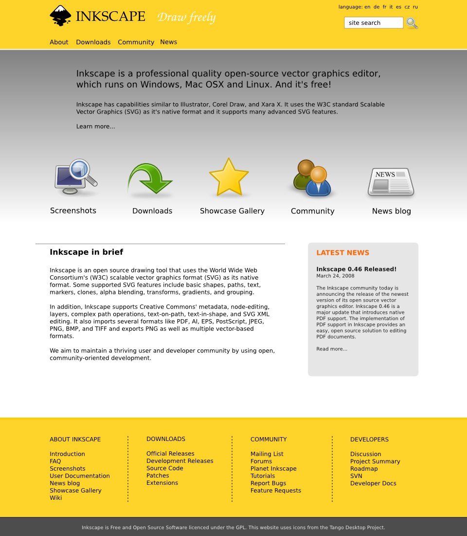
This is the front page of my submission for the Inkscape Website Redesign Contest - Phase 2 (development).
I have tried to make it attractive to potential users by leading them easily to more information and other sections of the site, without cluttering the page.
The main template of this design can be found here - [link] - that would be used for the remaining pages.
An example of the main design using a three-tier navigation system (maybe useful for the wiki) can be found here - [link]
The Tango icons can be used with attribution (included in the footer).
[Changes made from first phase submission:]
* changed title and slogan font
* changed colours (less wordpress.com-ish, more vibrant and unique)
* moved main navigation to the left
* changed summary text
* combined summary and icon sections, added gradient
* added icon for Showcase Gallery
* moved news snippet to a right column with grey background
* changed example front page text
* added dotted borders to footer navigation
* included attribution for the Tango icons in the footer
Comments9
Join the community to add your comment. Already a deviant? Log In
Very nice! I already liked the first draft, but I had the same propositions in mind as the other commenters before. Now I see that you fixed all of this, very good!
Only thing I would maybe add is some kind of fancy decoration in the header. It may be highly transparent and more elegant than intricate, but I wouldn't leave it out since it would show a typical use of Inkscape (decorations, ornaments, patterns...).
For the main colour of yellow, I like your decision and I would propose to generally agree on a specific colour pattern as some kind of "corporate identity". Until now I was thinking of green as typical "Inkscape colour" based on the current website, or even some lighter blue based on the tutorial files (I like this even more than the green, but I know it's more boring). Yellow is a good idea, too, we just should agree on one pattern and try to use it in all possible situations.